Just a few days ago we launched a new layout for our Nuffnang site.
If you guys knew the process it went through to get to this. We basically had all the different Nuffnang teams come up with different design on how they thought the Nuffnang site should look like. Then with some 4 mock-ups or so we sent it to the team leaders in each country that Nuffnang is in and they took a vote.
The winner was this one.

One thing about all our sites is that we thought since we were in four different countries, each site should have its own localized features.
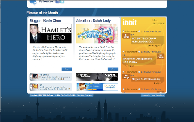
So what we did was… at the bottom of each page, we had the city skyline of the capital of the country we were in. Nuffnang Malaysia looks like this with the Petronas Twin Towers and the KL Tower visible.
(Pay attention to the bottom of the following screenshots and click to enlarge)
Nuffnang Singapore had the Singapore Flyer and some landmark Singapore buildings.
Nuffnang Australia had the Harbour Bridge and Sydney Tower.

And Nuffnang Philippines…
The other cool part that some of you may or may not notice is that…. during the day, the sun shows in the skyline. During the night, the sun sets and the stars come up. These screenshots I took of all the other countries were taken at night. But the screenshot for Nuffnang PH was taken during the day.
You can check out the different sites here.
Notice how they look?
Cool huh? I know I like it 🙂
If you’re a Nuffnang member login and check out the inside too.


 Timothy Tiah – Co-Founder of Colony, Kuala Lumpur Co-Working Space